|
Thread Number: 11195
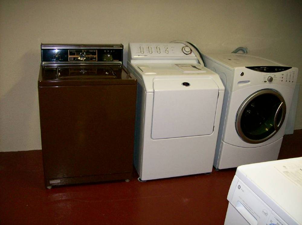
1982 Kenmore washer.. check out the color! |
[Down to Last] |

|
| Post# 201428 , Reply# 1 4/5/2007 at 17:30 (6,227 days old) by captainmoody () | ||
|
A shot with the lid up. I thought coppertone was discontinued by 1982? 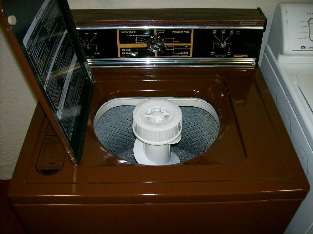
| ||
Post# 201429 , Reply# 2 4/5/2007 at 17:35 (6,227 days old) by pulsator  (Saint Joseph, MI) (Saint Joseph, MI) |
||
 | ||
| Post# 201432 , Reply# 3 4/5/2007 at 17:58 (6,227 days old) by westytoploader () | ||
|
Fantastic, and look, it still has the original sticker on the lid! | ||
|
Post# 201447 , Reply# 4 4/5/2007 at 19:22 (6,227 days old) by goatfarmer (South Bend, home of Champions) |
||
 | ||
| Post# 201449 , Reply# 5 4/5/2007 at 19:39 (6,227 days old) by danemodsandy (The Bramford, Apt. 7-E) | ||
|
They Changed the Name...
By that time, Coppertone was catalogued by Sears as "Coffee", and of course, it was no longer shaded. Coffee appliances were intended to look a little more updated than Coppertone ones, but they were still supposed to look okay with Coppertone. The unshaded Coffee was also cheaper to produce than a shaded colour; you didn't have to pay a skilled painter to produce those shaded edges. Of course, all that went away when the dread Almond came in. | ||
| Post# 201483 , Reply# 7 4/5/2007 at 21:58 (6,227 days old) by bellalaundry (St. Catharines, Ontario, Canada) | ||
 | ||
|
Post# 201484 , Reply# 8 4/5/2007 at 22:00 (6,227 days old) by dadoes (TX,�U.S. of A.) |
||
|
| ||
|
Post# 201493 , Reply# 9 4/5/2007 at 22:25 (6,227 days old) by peteski50 (New York) |
||
Kenmore! | ||
|
Post# 201501 , Reply# 10 4/6/2007 at 00:03 (6,227 days old) by cleanteamofny ((Monroe, New York) |
||
|
| ||
| Post# 201530 , Reply# 11 4/6/2007 at 07:44 (6,227 days old) by exploder3211 () | ||
|
I love that color... I wish it where closer! | ||
| Post# 201531 , Reply# 12 4/6/2007 at 07:45 (6,227 days old) by westyslantfront () | ||
|
Hi Dwight. Congratulations on your Lady Kenmore. It looks like a beautiful machine in mint condition. Ross | ||
|
Post# 201553 , Reply# 13 4/6/2007 at 08:48 (6,226 days old) by gansky1 (Omaha, The Home of the TV Dinner!) |
||
 | ||
| Post# 201560 , Reply# 14 4/6/2007 at 10:01 (6,226 days old) by peterh770 (Marietta, GA) | ||
 | ||
|
Post# 201586 , Reply# 17 4/6/2007 at 11:53 (6,226 days old) by gansky1 (Omaha, The Home of the TV Dinner!) |
||
|
I have the Fall/Winter 1982 catalog and that model was available in Coffee. $449.95 Peter, are you thinking of Mocha (from the early 60's) or Toast from the late 70's? Coffee was always a dark brown for Sears. Their coppertone was lighter in the 60's - usually with that awful shading around the edges. | ||
| Post# 201598 , Reply# 18 4/6/2007 at 12:28 (6,226 days old) by danemodsandy (The Bramford, Apt. 7-E) | ||
|
Coffee
I think Coffee was a colour that Sears came up with in response to customer complaints that they couldn't match Coppertone any more. Sears' customer base was too big in those days to ignore; they didn't want PO'ed customers prowling other retaillers in search of a match, I think. Nice gesture on Sears' part, but it didn't last long- the chain went to Hell in a handbasket not long after. | ||
| Post# 201621 , Reply# 19 4/6/2007 at 14:51 (6,226 days old) by hoover1060 () | ||
|
WOW now that is one gorgeous washer! Coffee or whatever, it is stunning! | ||
| Post# 201680 , Reply# 21 4/6/2007 at 18:30 (6,226 days old) by danemodsandy (The Bramford, Apt. 7-E) | ||
|
Uh, Okay
"the ever popular monochromatic look was introduced." Don't you mean "the grudgingly tolerated monochromatic look"? Major appliances have been boring as hell for about fifteen years now. You can hardly tell a TOL model from a BOL one without looking closely. It's cheap for manufacturers, but I don't know anyone who's really in ecstasy over it. If the mackerels running appliance companies can make whole damn refrigerator doors out of stainless steel, why can't they make a little trim out of it, and bump up the excitement factor a little? | ||
| Post# 201821 , Reply# 23 4/7/2007 at 07:44 (6,226 days old) by washaholic () | ||
|
I love that color. I wish they still used it. | ||
| Post# 201885 , Reply# 25 4/7/2007 at 11:25 (6,225 days old) by danemodsandy (The Bramford, Apt. 7-E) | ||
|
It'll Happen...
My feeling is that manufacturers are getting away with the monochromatic look for a time, but that more contrast will be seen in appliances again soon. Today's silk-screened control panels look cheap, even on expensive appliances. Sooner or later, a manufacturer will put a great-looking "retro" control panel on something, and it will sell well, and then other manufacturers will follow suit. It's all about fashion, really. There was no cost-cutting reason to change from silk-screened black control panels to white ones; it was just to get a new look into appliances, to make older ones look a little dated. Since manufacturers have done about everything they can with silk-screening, I predict we'll see a return to something more detailled, with some bright trim. Right now, white-on-white appliances look almost Soviet to me in their cheapness and austerity. Stainless fronts are a misguided attempt to brighten things up- they can be very high-maintenance, as anyone with a houseful of kids and a stainless reefer can tell you. Black is nearly as bad about showing every last finger mark. It'll change, trust me. | ||
| Forum Index: | 
| Other Forums: |

|

|

|

|

|

 Comes to the Rescue!