|
Thread Number: 55088
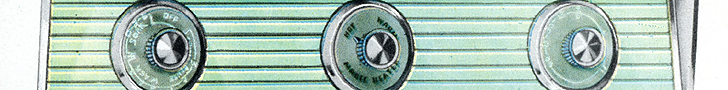
And the award for the most ugly dishwasher control panel goes to ..... |
[Down to Last] |
| Post# 774738 8/1/2014 at 16:52 (3,552 days old) by verizonbear (Glen Burnie ) | ||

| ||
|
| Post# 774749 , Reply# 1 8/1/2014 at 17:34 (3,552 days old) by washerdude (Canada ) | ||
|
But... I've seen uglier | ||
| Post# 774764 , Reply# 2 8/1/2014 at 18:28 (3,552 days old) by murando531 (Augusta, Georgia - US) | ||
 | ||
Post# 774778 , Reply# 3 8/1/2014 at 19:04 (3,552 days old) by combo52  (50 Year Repair Tech Beltsville,Md) (50 Year Repair Tech Beltsville,Md) |
||
Thats Just a Maytag Panel 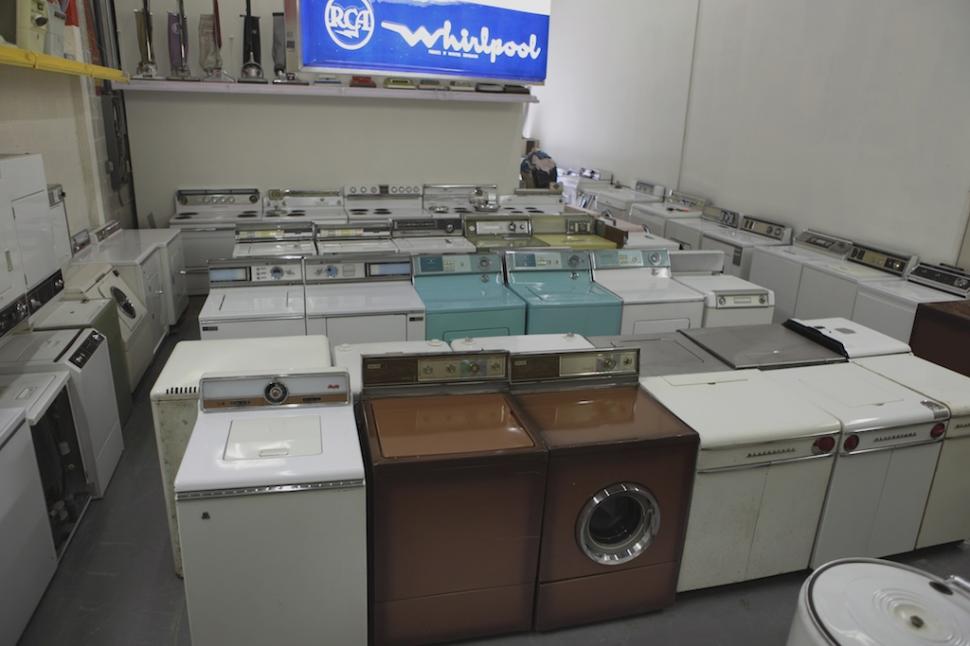 | ||
| Post# 774807 , Reply# 4 8/1/2014 at 20:01 (3,552 days old) by tecnopolis (Ocala/Dunnellon, Florida 34481) | ||
 | ||
|
Post# 774817 , Reply# 5 8/1/2014 at 20:14 (3,552 days old) by Frigilux (The Minnesota Prairie) |
||
 | ||
| Post# 774824 , Reply# 6 8/1/2014 at 20:43 (3,552 days old) by tecnopolis (Ocala/Dunnellon, Florida 34481) | ||
|
| ||
| Post# 774825 , Reply# 7 8/1/2014 at 20:44 (3,552 days old) by tecnopolis (Ocala/Dunnellon, Florida 34481) | ||
|
| ||
| Post# 774827 , Reply# 8 8/1/2014 at 20:46 (3,552 days old) by tecnopolis (Ocala/Dunnellon, Florida 34481) | ||
|
| ||
| Post# 774838 , Reply# 9 8/1/2014 at 21:22 (3,552 days old) by danmantn (Tennessee) | ||
When I was researching SQ, I called their HQ and asked when they were going to redesign their panel...he said they just did. With a chuckle. I like them, with the exception of the cheesy "RadioShack" extra rinse flip switch. They are waaaaaaay nicer than the previous generation.
The color inserts...I have red on one set and the green on the other do help dress it up a bit. | ||
| Post# 774849 , Reply# 10 8/1/2014 at 22:50 (3,552 days old) by funktionalart (Rison, AR) | ||
Kill it with... | ||
| Post# 774914 , Reply# 12 8/2/2014 at 03:19 (3,552 days old) by tecnopolis (Ocala/Dunnellon, Florida 34481) | ||
|
| ||
| Post# 774941 , Reply# 13 8/2/2014 at 07:11 (3,551 days old) by whirlcool (Just North Of Houston, Texas) | ||
|
And that first pic is an Admiral. BOL if there ever was one. But the Kenmore that came with our house was even more BOL that the one pictured here. It had one dial that said "On" & "Off" and an switch that said "Heated Dry" On/Off. That was it. | ||
|
Post# 774964 , Reply# 14 8/2/2014 at 09:37 (3,551 days old) by pulltostart (Mobile, AL) |
||
I'll chime in I agree with the comments about the 'swoopy' graphics - cannot stand that styling trend. I do have a pair of SQ's and although the control panel could look better without that element, I do find it tolerable. One of the worst examples of 'swoops' is this nasty Maytag console. WTH was the designer smoking when they came up with these graphics??? Three words - nasty, nasty, nasty.
I also detest those little rocker switches that have found their way onto every appliance imaginable. Whoever designed and patented that sucker has to be making a fortune because they're everywhere - washers, dryers, ranges, dishwashers.
I prefer clean(er) styling in general. Although there's not a lot to be said for GE's post-filter-flo laundry products, I do like the styling of this pair. The simple controls with the washer and the dryer consoles matching is really nice (personal opinion).
lawrence | ||
| Post# 774972 , Reply# 15 8/2/2014 at 10:11 (3,551 days old) by washman (o) | ||
|
I like the big knobs on the SQ, I don't like the dryer cycle knob though. Too much "slack" on the settings means it is a tad difficult to set precisely. Also it clicks clacks and makes it's plebian origins well known as it advances 'round the cycle. | ||
| Post# 774975 , Reply# 16 8/2/2014 at 11:01 (3,551 days old) by murando531 (Augusta, Georgia - US) | ||
|
I agree about the Maytag, that's hideous. That's back when even MT's logo was gross. I love the current one, it just has a very robust look about it. I do wish they would bring back the 3 curved bar logo and implement it into the current one somehow. I know on my MDB4709, the old logo is hidden like an Easter egg in the upper wash arm supply bracket.
| ||
| Post# 774977 , Reply# 17 8/2/2014 at 11:03 (3,551 days old) by murando531 (Augusta, Georgia - US) | ||
|
| ||
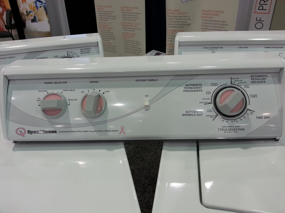
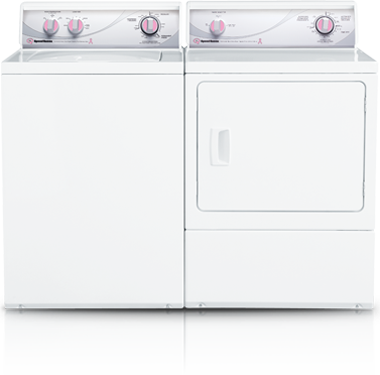
| Post# 774989 , Reply# 18 8/2/2014 at 12:32 (3,551 days old) by verizonbear (Glen Burnie ) | ||
|
speed queen control panels ergonomics for baby boomers I am thinking that speed queen realized only baby boomers would recognize the quality of their products and have the financial capacity to purchase these units.
Looking at the long term, ( since these units are built to last) I think their design reasoning is more to accommodate potential arthritic hands and failing eyesight as boomers age. The simplicity of the control panel speaks to itself.
They should of added a full length light to the contral panel with an illuminated switch | ||
|
Post# 774990 , Reply# 19 8/2/2014 at 12:55 (3,551 days old) by pulltostart (Mobile, AL) |
||
|
Breast Cancer Awareness SQ's | ||
|
Post# 774996 , Reply# 20 8/2/2014 at 15:14 (3,551 days old) by pulltostart (Mobile, AL) |
||
|
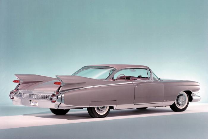
Clean Styling Although not exactly "clean" or "minimal" by today's standards, Olds used the phrase "The Linear Look" for their 1959 models. Great graphics and pretty darn zoomie cars, too!
Typical Ad
lawrence
View Full Size
| ||
| Post# 775033 , Reply# 21 8/2/2014 at 20:28 (3,551 days old) by tecnopolis (Ocala/Dunnellon, Florida 34481) | ||
|
| ||
| Post# 775044 , Reply# 22 8/2/2014 at 20:52 (3,551 days old) by dnastrau (Lords Valley, PA) | ||
|
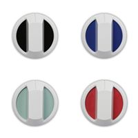
Speed Queen pink control panel The pink control panel models were a limited edition as part of a promotion last year (see link). Andrew S. CLICK HERE TO GO TO dnastrau's LINK | ||
| Post# 775050 , Reply# 23 8/2/2014 at 21:04 (3,551 days old) by tecnopolis (Ocala/Dunnellon, Florida 34481) | ||
|
| ||
| Post# 775052 , Reply# 24 8/2/2014 at 21:22 (3,551 days old) by tecnopolis (Ocala/Dunnellon, Florida 34481) | ||
|
| ||
| Post# 775279 , Reply# 25 8/3/2014 at 23:12 (3,550 days old) by danmantn (Tennessee) | ||
|
Apparently SQ does tweak it's controls. I noticed that between my original 2009 model and the 2011 model the knobs had ridges added (the washer knob was hard to pull out with wet fingers). Adding indentions/ridges made it much easier on the new model. I called them and they sent me a newer design for the 2009 model. :)
I like the big knobs, and I'm not baby boomer. Just hate the flip/toggle switches...cheapens the look. And the swoop design is subtle. | ||
| Post# 775327 , Reply# 26 8/4/2014 at 07:44 (3,549 days old) by mayken4now (Panama City, Florida) | ||
Toggle Switch Hell
In 1996, my best friend and I just had to have the MAH4000AWW and it's mate. Good, love the way the looked/performed etc. At the time we both had gone to a Maytag dealer in Tampa Florida, each bought a matching set to take home that day. First, we did his, then went to my house and installed mine. Within the first day, I called him as he was calling me (at the same time) to discuss why the dryer had this stupid chime on/off toggle switch and did not match the signal on/off button like the washer. We called Maytag, yes still Newton at that time and got some lame answer. We let them know that it was tacky and a big oops, and decided they came up with this "quick cheap fix on hangover Monday. As of today, I still look at it and think it's ridiculous that it does not match the on/off button underneath the start/stop for the washer.
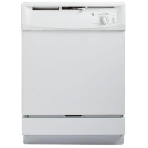
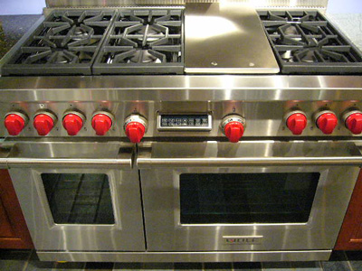
As for the ugly dishwasher, Gee Ree hands down. | ||
| Forum Index: | 
| Other Forums: |

|

|

|

|

|

 Comes to the Rescue!


;)
;)
;)
;)