|
Thread Number: 34954
Do you like the new Whirlpool logo? |
[Down to Last] |
| Post# 523255 6/8/2011 at 00:59 (4,706 days old) by danmantn (Tennessee) | ||
I noticed it on Whirlpool.com...looks plain like the new Kenmore logo. meh.
CLICK HERE TO GO TO danmantn's LINK | ||

|
| Post# 523257 , Reply# 1 6/8/2011 at 01:04 (4,705 days old) by danmantn (Tennessee) | ||
|
Well, apparently I'm late to the party...been out since November.
CLICK HERE TO GO TO danmantn's LINK | ||
Post# 523259 , Reply# 2 6/8/2011 at 02:34 (4,705 days old) by spiralator60  (Los Angeles) (Los Angeles) |
||
|
100th Anniversary Logo This is the first that I have heard about Whirlpool redesigning its logo. Boring and uninspired are the terms that come to mind when seeing it. No, I don't like the new logo. | ||
| Post# 523268 , Reply# 3 6/8/2011 at 05:17 (4,705 days old) by pierreandreply4 (St-Bruno de montarville (province of quebec) canada) | ||
 | ||
| Post# 523272 , Reply# 4 6/8/2011 at 06:21 (4,705 days old) by mrb627 (Buford, GA) | ||
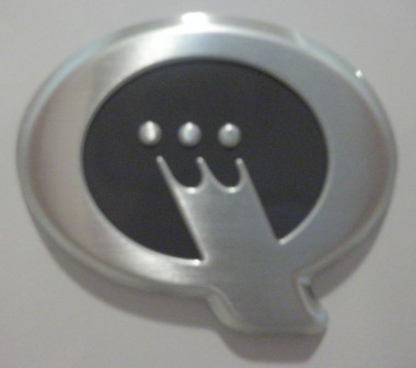
New Font? | ||
| Post# 523275 , Reply# 5 6/8/2011 at 06:39 (4,705 days old) by DanManTN (Tennessee) | ||
|
| ||
|
Post# 523285 , Reply# 6 6/8/2011 at 08:13 (4,705 days old) by searsbest (Attleboro, Ma) |
||
Whirlpool logo | ||
| Post# 523290 , Reply# 7 6/8/2011 at 08:28 (4,705 days old) by mtn1584 (USA) | ||
|
Whirpool's new logo Hate it!!!!!!!!!! Mike | ||
| Post# 523306 , Reply# 8 6/8/2011 at 09:23 (4,705 days old) by georgect (Fairfield, CT) | ||
|
Maybe they wanted to change the look to a "modern" update but it lacks character now.
Even the whirlpool spiral over the W is lacking punch (it's sparse looking). It doesn't move me at all and don't see the point of the change. Side be side comparison link below. CLICK HERE TO GO TO georgect's LINK | ||
| Post# 523356 , Reply# 10 6/8/2011 at 13:30 (4,705 days old) by AutowasherFreak () | ||
|
I like the old one better!
| ||
| Post# 523361 , Reply# 11 6/8/2011 at 13:54 (4,705 days old) by Maytagbear (N.E. Ohio) | ||
|
I like it. I look at it multiple times a day on my refrigerator and range. Honestly, I don't care very much, as long as the appliance does what I want it to do. Keep my food safe and cold, and cook my food. Which they do, very well. Lawrence/Maytagbear | ||
|
Post# 523370 , Reply# 12 6/8/2011 at 14:22 (4,705 days old) by joe_in_philly (Philadelphia, PA, USA) |
||
 | ||
| Post# 523374 , Reply# 13 6/8/2011 at 15:05 (4,705 days old) by pierreandreply4 (St-Bruno de montarville (province of quebec) canada) | ||
|
the point is | ||
| Post# 523377 , Reply# 14 6/8/2011 at 15:18 (4,705 days old) by arbilab (Ft Worth TX (Ridglea)) | ||
 | ||
| Post# 523380 , Reply# 15 6/8/2011 at 15:22 (4,705 days old) by StrongEnough78 (California) | ||
|
| ||
| Post# 523392 , Reply# 16 6/8/2011 at 16:07 (4,705 days old) by Maytagbear (N.E. Ohio) | ||
|
Sooooooooo as long as it "looks pretty," you don't give a hoot how something works? Lawrence/Maytagbear | ||
| Post# 523398 , Reply# 18 6/8/2011 at 16:51 (4,705 days old) by washmeup (scottsdale) | ||
Well | ||
| Post# 523418 , Reply# 19 6/8/2011 at 18:17 (4,705 days old) by DanManTN (Tennessee) | ||
|
| ||
|
Post# 523461 , Reply# 20 6/8/2011 at 23:34 (4,705 days old) by neptunebob (Pittsburgh, PA) |
||
 | ||
|
Post# 523464 , Reply# 21 6/8/2011 at 23:49 (4,705 days old) by tolivac (greenville nc) |
||
|
Like the old better as well.the new one looks--cheap. | ||
| Post# 523635 , Reply# 22 6/9/2011 at 19:57 (4,704 days old) by whirlcool (Just North Of Houston, Texas) | ||
|
Pointless change. What were they thinking, saving 3% on ink? The bean counters are at it again. Sheesh. The Whirlpool graphic doesn't even look like a Whirlpool anymore and the new font looks cheap. | ||
| Post# 523650 , Reply# 23 6/9/2011 at 20:57 (4,704 days old) by spinmon (st. charles mo ) | ||
|
I guess they're showing us what to expect from them & their products;less performance(weak whirpool)& less customer loyalty/interaction/service(weak/generic/classless lettering). But,compared to the state of the World in general,a non-issue. | ||
|
Post# 523752 , Reply# 24 6/10/2011 at 12:40 (4,703 days old) by mistereric (New Jersey (Taylor Ham)) |
||
|
What a boring typeface. And what is up with the kerning between the "hi" and the "lp"? Also, any time a ligature dies, i'm sad (Wh).
The old logo looks like it was designed by a designer. The new looks like it was selected from the built-in font pack of Windows XP. What a shame. Things must be rough when ya can't afford a serif. | ||
| Post# 523771 , Reply# 25 6/10/2011 at 13:44 (4,703 days old) by arbilab (Ft Worth TX (Ridglea)) | ||
|
| ||
| Post# 523774 , Reply# 26 6/10/2011 at 14:28 (4,703 days old) by aquarius8000 () | ||
|
just a minuite... Its the same exeept it says 'Whirlpool appliances ' | ||
|
Post# 523782 , Reply# 27 6/10/2011 at 15:12 (4,703 days old) by JoeEkaitis (Rialto, California, USA) |
||
 | ||
| Post# 523805 , Reply# 28 6/10/2011 at 18:31 (4,703 days old) by roto204 (Tucson, AZ) | ||
Ick There's a love-affair on with sans-serif fonts these days. I knew what was coming when Apple vaunted Myriad Pro to the forefront, and suddenly, placards in Wal-Mart leveraged the typeface. It was novel before everyone adopted it. Now I wish Apple would go back to Apple Garamond.
The thing that makes me wince about this new logo (emaciated appearance aside) is the whirlpool over the 'W' itself. The line art is sloppy and asymmetrical, and incomplete. The swirls of the whirlpool no longer connect. Usually logo graphics simplify by reducing line complexity, but never completeness. I'm really, truly surprised that this struck people as the best. (Makes me wonder what the runners-up were.) My eye is immediately drawn to the "lump" caused by the off-kilter swirl. Yucky. | ||
| Post# 523806 , Reply# 29 6/10/2011 at 19:01 (4,703 days old) by danmantn (Tennessee) | ||
|
| ||
|
Post# 523834 , Reply# 30 6/10/2011 at 22:45 (4,703 days old) by rp2813 (Sannazay) |
||
There's a love-affair on with sans-serif fonts these day I was going to say likewise, so am glad I read through all posts! Anything sans serif strikes me as governmental and institutional, which has a logic behind for those uses, but there is nothing stopping a corporation from using a distinctive logo or font with some personality.
It's been a steady downhill spiral for creativity and originality in design since the height of the MCM period. Perhaps we've finally hit bottom because this is a love affair of which I highly disapprove. | ||
|
Post# 523854 , Reply# 31 6/11/2011 at 05:08 (4,702 days old) by Frigilux (The Minnesota Prairie) |
||
 It isn't quite as uninspired as Frigidaire's new one, which is certainly the nadir of logo designs. I think calling it 'designed' is probably assuming a bit too much.
Interesting that Whirlpool is using its prior logo in the video for their high-tech Vantage laundry pair. I'm with Nate on this one. The 'whirlpool' graphic above the W is annoying in its poor execution.
Who the hell approves these cold, soulless logos---and how awful must the runners-up be if these are the best of the portfolio? 
| ||
| Post# 523855 , Reply# 32 6/11/2011 at 05:16 (4,702 days old) by mrcleanjeans (milwaukee wi) | ||
|
NO!!! Plain,bare-boned,uninspiring! | ||
| Post# 524032 , Reply# 33 6/12/2011 at 01:30 (4,701 days old) by pierreandreply4 (St-Bruno de montarville (province of quebec) canada) | ||
|
i don't see anything wrong in a logo change over the yea | ||
| Post# 524033 , Reply# 34 6/12/2011 at 01:32 (4,701 days old) by pierreandreply4 (St-Bruno de montarville (province of quebec) canada) | ||
|
Pic number 2 and how it look on 70 appliance | ||
| Forum Index: | 
| Other Forums: |

|

|

|

|

|

 Comes to the Rescue!